Creating a soothing and tranquil atmosphere in your home starts with the colors you choose for your walls, furniture, and décor. Calm colors can help reduce stress and make your living space a peaceful retreat. But with so many options available, how do you pick the right shades to bring serenity to your home? In this post, we’ll guide you through the essentials of choosing calm colors and provide practical tips to help you design a relaxing environment.
Why Choose Calm Colors for Your Home?
Colors influence our moods and emotions in profound ways. Warm, bright colors might energize you, while soft, muted tones tend to promote relaxation and restfulness. Incorporating calm colors into your interiors can:
– Reduce feelings of anxiety and stress
– Enhance your quality of rest and sleep, especially in bedrooms
– Create a welcoming and peaceful space for family and guests
– Offer a timeless, elegant backdrop that complements various décor styles
Understanding Color Psychology
Before selecting colors, it helps to understand how different hues affect us:
– Blues: Often associated with calmness and tranquility. Blue tones can lower blood pressure and slow breathing.
– Greens: Remind us of nature and growth, fostering balance and harmony.
– Neutrals: Shades like beige, creams, and soft grays evoke simplicity and cleanliness without overwhelming the senses.
– Soft Pinks and Lavenders: Gentle shades that promote warmth and comfort without being too stimulating.
Knowing these effects allows you to pick colors that best suit the mood you want to create.
Tips for Selecting Calm Colors
1. Start with Light, Muted Shades
Bright, intense colors tend to be energizing, so for a calm ambiance, opt for lighter, softer versions of your favorite hues. Muted pastels or shades with gray undertones help create subtle, restful walls and accents.
2. Consider Your Lighting
Natural and artificial lighting greatly affect how colors look in your space. Test paint swatches in various lighting conditions throughout the day before committing. A color may appear cool and serene in daylight but warmer or more vibrant under indoor lights.
3. Use a Neutral Base
Neutral colors like soft whites, greys, and taupes make excellent bases. They allow you to incorporate gentle accent colors without overwhelming the room. A neutral canvas makes it easier to swap accent elements over time.
4. Incorporate Nature-Inspired Tones
Colors inspired by nature are inherently calming because they connect us to the outdoors. Consider sage green, sky blue, sand beige, or stone gray. These shades can adapt to various styles and bring a refreshing feel to your interiors.
5. Limit Bold Accents
While accents can add personality, bold reds or oranges can disrupt a calm atmosphere. Instead, use gentle tones in decorative pillows, rugs, and artwork to maintain serenity without monotony.
6. Think About Room Function
Different rooms benefit from different calm colors. For example:
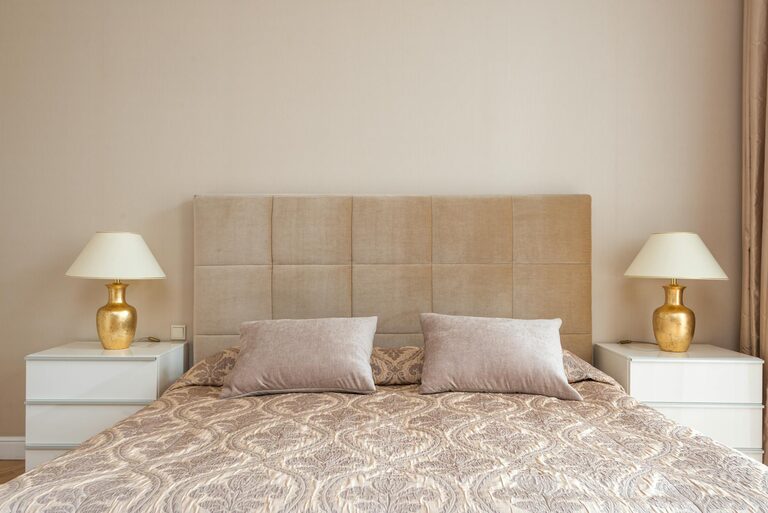
– Bedrooms: Soft blues, lavenders, or warm neutrals promote sleep and relaxation.
– Living Rooms: Earthy greens and warm beiges invite comfort and conversation.
– Bathrooms: Crisp whites and light blues create a spa-like, clean feel.
7. Create a Cohesive Palette
Choose a color scheme with 2–3 complementary calm colors to maintain flow between rooms without overwhelming the senses. Tools like color wheels or online palette generators can help you find balanced combinations.
8. Test Samples on Larger Surfaces
Small paint chips can be misleading. Apply larger test patches on your walls and live with them for a few days to see how they feel during different times and activities.
Common Calm Color Choices and Their Benefits
| Color | Effect | Best Used In |
|—————|——————————————-|———————-|
| Pale Blue | Serene and cool, aids relaxation | Bedrooms, bathrooms |
| Sage Green | Earthy and refreshing, reduces stress | Living spaces, kitchens|
| Light Gray | Modern and sophisticated calm | Offices, bedrooms |
| Soft Taupe | Warm and grounding with subtle elegance | Living rooms, halls |
| Lavender | Cozy yet soothing, gentle mood enhancer | Bedrooms, lounges |
Additional Tips for Maintaining Calmness in Your Color Scheme
– Choose Matte or Satin Finishes: Avoid glossy paints that reflect too much light and can feel harsh.
– Layer with Textures: Use fabrics, wood, and natural fibers in complementary colors to add warmth to the space.
– Balance Color and White Space: Too much color can feel busy; intersperse calm colors with white or open space for breathing room.
Final Thoughts
Selecting calm colors for your home is an enjoyable and rewarding process when you focus on the atmosphere you want to create. Whether you prefer soft blues, gentle greens, or warm neutrals, thoughtful color choices can transform your space into a peaceful haven. Remember to test your options carefully and enjoy the creative journey toward a more restful home.
—
With these tips, you’re ready to bring a calming color palette into your home that supports relaxation and well-being. Happy decorating!